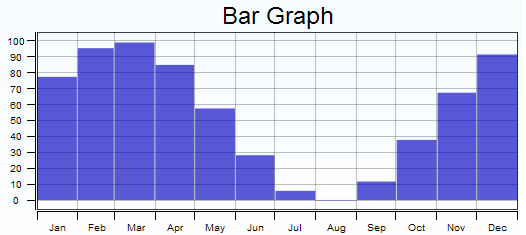
This object displays historical data from one or more data sources, allowing you to compare two different readings over time. The Bar Graph object more difficult to configure, but is very flexible, allowing for a wide range of different types of comparisons.
Shows data for the days of the week for a given week.
Calendar Month
Shows data for the days in a given month
Relative to Present
Shows data for a specified number of days relative to the current date
Hours
Calendar Day
Shows data for the hours for a given day
Relative to Present
Shows data for a specified number of hour relative to the current time
Months
Calendar Year
Shows data for the months of a given year
Relative to Present
Shows data for a specified number of months relative to the current month
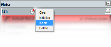
Plots
By default, you will have one data point that will appear on the graph. However, if you right-click next to the plot number, you are given some options, including the option to Insert an additional plot. You can add several plots one at a time. To link a plot to a data point, click on the red Links icon, which will open the Point Manager window. Use the Point Manager to select the data source you wish to display in the Plot. (See the Point Manager page for more information about selecting data.) The current value retrieved from the data source will be shown in the Current Value text box.
If you need to convert your data, such as changing between US customary units and metric units (Fahrenheit to Celsius), from base units to derived units (Hertz to Megahertz), or between derived units (gallons to cubic feet), the Unit Multiplier and the Unit Offset allow you to do just that. With Data Interpretations, you have the option of graphing either Normal, which uses the actual values of the data, or Change Over Time, which shows the changes of those values over time.
To change the color of the bars, select a color from the Color Picker by clicking on the box next to Color or by entering the hexadecimal value in the Color text box.You can also be adjust the transparency of the color with the slider to the left of the text box.
The data from a Vantage Point Display Server is always retrieved by a presentation in the context of the current date and time. For example, if you have chosen Hours as the Time Scale Unit, you can either display the data by hours of the current day (Calendar Day) or the previous 24 hours (Relative to Present). Regardless of which Time Scale Unit you choose, Relative to Present always displays data leading up to the present. However, if you choose one of the other behaviors, you can alter the time period shown with the Offset option in the Time Scale Settings. The offset is relative to the present and is the same units as the chosen Time Scale Unit.
Auto Fit Mode
This setting allows you to specify how the plotted data is displayed in relation to the graph. You have the option between Axis Locked Fit (default), Fixed Range, Sliding Fit, and Disabled.
Axis Locked Fit, which is the default, places the high value at the top of the graph while leaving you to determine the position of the low value on the graph by adjusting the Axis Y setting. Minimum Range specifies the minimum difference between the displaying of the high value and the low value. Border Margin determines the physical distance between the high value and the edge of the graph.
With Fixed Range, you specify the maximum and minimum values that the graph will show. Enter a value into the respective text box, or click and hold the respective Up/Down arrow to the left of the Max Value and Min Value labels and move the mouse cursor up the screen to increase the respective value or down the screen to decrease it.
Sliding Fit attempts to maximize the amount of space the displayed data plotting occupies within the graph. With Minimum Range you specify the minimum difference between the displaying of the high value and the low value. Border Margin determines the physical distance between the high value and low value from the edges of the graph.
Display Properties
Text Properties
Use the Title text box to give your bar graph a title. With Title Alignment, choose where the title appears in relation to the Bar Graph – top, bottom, both, or neither. Color the text of the Title with Title Color, selecting a color from the Color Picker by clicking on the colored box next to Title Color or by entering the hexadecimal value in the text box. (The first two hexadecimal characters represent the color's transparency, which you can also modify with the slider to the left of the text box.)
Use the X-Axis Label to identify the X-Axis and the Y-Axis Label to identify the Y-Axis. With X-Axis Alignment, chose where the X-Axis Label appears in relation to the Bar Graph – top, bottom, both, or hidden. With Y-Axis Alignment, chose where the Y-Axis Label appears in relation to the Bar Graph – left, right, both, or hidden. Color the text of the axis labels with Label Color, selecting a color from the Color Picker by clicking on the colored box next to Label Color or by entering the hexadecimal value in the text box. (The first two hexadecimal characters represent the color's transparency, which you can also modify with the slider to the left of the text box.)
The Label Fonts settings allow you to modify the font of the Indicators, Labels, and Title. From the drop-down boxes, you can select a Typeface from among those installed on your computer. Check boxes allow you to Bold and Italic the labels. Select a Font Size by entering a value into the font size text box, from 1 to 72 in 0.001 increments, or by clicking and holding on the up/down arrow to the right of the font size text box and moving the mouse cursor up the screen to increase the font size or down the screen to decrease it.
Bar Gap
This setting allows you specify the white space between the bars of the graph. You can enter a value, which is represented in pixels, in the Bar Gap text box, or you can click on the up/down arrow to the right of the text box and move the mouse cursor up the screen to increase the font and down the screen to decrease it.
Axis Properties
The Axis Color, Outline Color, and Grid Color settings allow you to adjust the color of their respective elements. Select a color from the Color Picker by clicking on the colored box next to Axis Color, Outline Color, or Grid Color, or by entering the hexadecimal value in the adjacent text box. You can also be adjust the transparency of the color with the slider to the left of the text box.
Tick lengths indicate how far the lines which indicate values extend past the graph. Enter numbers into either the X-Axis Tick Length or Y-Axis Tick Length text boxes to adjust the respective values, or click and hold on one of the respective Up/Down arrows adjacent to them and move the mouse cursor up the screen to increase the value or down the screen to decrease the value.
If you want to increase or decrease the distance between the ticks and their values, use the X-Axis Margin or the Y-Axis Margin text boxes to adjust their respective values.
Background Settings
Choose from one of the following options from the drop-down box (click a property for more information):
Circular Gradient - Transitions from one color to another in a circular pattern.
Border Padding
This setting allows you specify the amount of white space between the graph itself and the edge of the object containing it. Enter a value, which is represented in pixels, in the Border Padding text box, or click and hold on the up/down arrow to the left of the text box and move the mouse cursor up the screen to increase the distance and down the screen to decrease it.