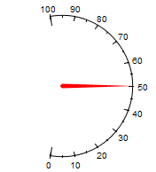
The Angle Gauge object allows you to display data in a manner similar to a speedometer, or a power meter. With adjustable starting/ending angles and values, many configurations are possible.
To include information stored in a Vantage Point Server, click on the red Links icon, which will open the Point Manager window. Use the Point Manager to select the data source you wish to display in the Angle Gauge object. See the Point Manager page for more information about selecting data. The current value of the retrieved data will be shown in the Current Value text box.
Maximum Value and Minimum Value are what the gauge itself displays respectively as maximum and minimum values.
Appearance Properties
Background and Foreground
For both the Background and Foreground, you can choose from one of the following options from the drop-down box (click a property for more information):
Circular Gradient - Transitions from one color to another in a circular pattern.
Indicator
By default, the Indicator is solid red in color and 5 pixels in thickness. To change the color from the Color Picker, click on the colored box next to Indicator Color. Alternatively, you can enter the hexadecimal value in the text box. You can also be adjust the transparency of the color with the slider to the left of the text box.
If you have a particular image you would like to use in place of the default Indicator, type the image's location in the Indicator URL or navigate to its location by clicking on the ellipsis box to the right of the Indicator URL text box.
Scale Properties
The Visible setting tells the presentation whether or not to display the ticks and values on the gauge. Background Color alters the color behind the values while Foreground Color alters the color of the ticks. Major Increments determine the frequency of long ticks and Minor Increments determine the frequency of short ticks. Radius adjusts the diameter of the gauge, altering the object's size if necessary to accommodate the new radius.
The Start Angle and End Angle tell gauge where to place on the circle the low value and high value respectively. 0 and 360 are located at the center-right of the the circle. Values less than 0 and greater than 360 are acceptable.
Text Properties
The Visible setting under Text Properties tells the presentation whether or not to display the values of the ticks. You can also chose the color of the text by selecting a color using the Color Picker, click on the colored box to the left of Color. Alternately, you can enter a hexadecimal value directly into the Color text box. You can also be adjust the transparency of the color with the slider to the left of the text box.
Font settings allow to further alter the appearance of these values. Select a new typeface from those installed on your computer by using the drop-down box and change the size by entering a new value into the font size text box, or by clicking on the up/down arrow and moving the mouse cursor up the screen to increase the size or down the screen to decrease the size. For Bold or Italic, simply check the appropriate box. Decimal Places allow you to add decimals to values to as many places as you indicate in the text box.